How to Measure the Liquidity Threshold in a Marketplace
The liquidity threshold is the minimum condition at which a two-sided marketplace reliably matches supply and demand within an acceptable time window for both sides. It is not a single number. It is a state, and most operators never measure whether they have actually reached it.
Simpler: the liquidity threshold is the point at which users can reliably find a match in the category they are searching, within the time window they expect.
Most teams count total supply and total demand. If both numbers are growing, the assumption is that the marketplace is working. That assumption causes most early-stage marketplace failures.
This article introduces the Liquidity Threshold Framework, a six-signal diagnostic system that indicates whether your marketplace has entered reliable match-making territory. If you are deciding whether to scale acquisition, open a new category, or expand to a new geography, this diagnostic should run first.
| What is the liquidity threshold in a marketplace? The liquidity threshold is the minimum condition at which a two-sided marketplace reliably matches supply and demand within an acceptable time window for both sides. A marketplace can have growing supply and demand and still be below this threshold if supply is in the wrong category, geographic area, or time window. |
What Most Marketplace Operators Get Wrong About Liquidity

The standard view is that liquidity equals supply plus demand. Add more of each, and the marketplace gets more liquid. I believed this too.
It is wrong. A marketplace can have 100,000 active suppliers and still be structurally illiquid if those suppliers are not in the three categories, five cities, or two time windows where 80% of demand is searching.
This is the core error. Operators are measuring aggregate supply when they should be measuring supply coverage, the match between where demand is searching and where supply actually exists. The Liquidity Threshold Framework forces that shift.
The second error is treating low conversion as a demand problem. Bad ads. Wrong audience. Weak messaging. These get the blame. But when I started breaking conversion data by category and geography instead of looking at it in aggregate, the pattern changed. Conversion was not the problem. Coverage was the problem. Three categories were below the match threshold. Demand was showing up. Supply was not where demand was looking.
The Liquidity Threshold Framework: Six Signals That Tell You If You Are Liquid
The Liquidity Threshold Framework is a six-signal diagnostic system that measures whether a two-sided marketplace has achieved the minimum conditions for reliable match-making. The six signals are category-level match rate, time-to-match, repeat search behavior, abandoned search rate, supply coverage gap, and segment imbalance signal.
Each signal identifies a different failure mode. None of them are redundant. A marketplace can pass five of the six and still be illiquid in the failure mode that matters most for the category you are about to scale.
The framework does not generate a single liquidity score. It generates a readiness map. You learn which signals are healthy, which are at-risk, and exactly where to focus before opening the acquisition budget.
Put differently: the Liquidity Threshold Framework measures whether a marketplace is ready to scale acquisition safely, not whether it looks ready in aggregate.
Liquidity Threshold Diagnostic Dashboard
The table below is the core visual structure of the Liquidity Threshold Framework. Each signal has its own measurement definition, healthy threshold, warning threshold, and failure threshold. Run this across your current data before any scale decision.
| Signal | What to Measure | Healthy | Warning | Failure |
| Category Match Rate | % of demand requests matched per category | > 65% | 45–65% | < 45% |
| Time-to-Match | Hours from request to confirmed match | < 4h (service) | 4–12h | > 12h |
| Repeat Search Behavior | Same user, same category, no conversion | < 10% of users | 10–20% | > 20% |
| Abandoned Search Rate | Searches ending without result engagement | < 15% | 15–30% | > 30% |
| Supply Coverage Gap | Demand volume vs. fulfillable supply by segment | < 5% gap | 5–15% gap | > 15% gap |
| Segment Imbalance Signal | Ratio misalignment by geo / category / time slot | < 10% variance | 10–25% | > 25% |
Signal 1: What Is Category-Level Match Rate and Why Aggregate Data Hides the Problem?
| What is the category-level match rate? Category-level match rate is the percentage of demand requests in a specific category that are successfully matched to available supply within a defined session. Aggregate match rate hides category-level failure. A healthy marketplace typically targets category match rates above 65 percent. Below 45 percent, supply coverage is insufficient to sustain demand-side retention. |
Aggregate match rate is a lie. If your platform shows an 72% overall match rate, the temptation is to declare liquidity and scale. Do not do this.

When I broke match rate down by category for the first time, the aggregate looked fine. Three individual categories were at 38%, 41%, and 44%. Those categories were driving most of the search volume that month. The aggregate number was masking a structural failure in exactly the categories where demand was concentrated.
Match rate by category should be calculated weekly, not monthly. Aggregate monthly numbers smooth over the failure events that happen in specific windows. Weekly category-level data shows you where the floor is dropping before the churn signal appears.
The threshold signal: any category below 45% match rate is a red flag. Any category between 45% and 65% is in warning territory. Categories above 65% with consistent supply coverage are operating as liquid.
Signal 2: How Does Time-to-Match Determine Whether Demand Comes Back?

return probability drops sharply as intent decays into abandonment.
| What is time-to-match in a marketplace? Time-to-match is the elapsed time between a demand-side request and a confirmed supply-side match in a marketplace transaction. For service marketplaces, demand-side repeat behavior requires time-to-match under four hours. Above twelve hours, first-session abandonment rates climb and return visit probability drops sharply. |
The first time I measured time-to-match at the category level rather than the platform level, I expected the variance to be minimal. It was not. Time-to-match ranged from under two hours in high-supply categories to over 18 hours in three underserved segments.
Time-to-match is a proxy for supply depth. Categories with fast match times have adequate supply and the right geographic distribution. Categories with slow match times are telling you where supply coverage is failing, even when the aggregate supply number looks acceptable.
Product marketplaces can sustain longer match windows than service marketplaces. But only when search-to-result quality is high. If a buyer searches and gets low-relevance results, a 24-hour fulfillment window does not compensate for a poor first impression.
The rule I use is: if the time-to-match in a category exceeds the reasonable patience window for that category’s buyer, the category is not liquid. It may have supply. But it does not have liquid supply.
Signal 3: Why Repeat Search Behavior Is the Leading Indicator You Are Missing

supply coverage failure rather than a targeting problem.
Repeated search behavior is a demand-side signal indicating that a user has searched for the same or an equivalent offering more than once without converting. Most analytics platforms do not surface this by default. That is a problem because repeat search behavior predicts supply-side failure weeks before churn data reflects it.
When a user searches for a category, gets results, and leaves without converting, then searches again the next day, the instinct is to blame targeting or messaging. The actual signal is the supply gap. They came back because they still want the thing. They did not convert because the thing was not actually available in a form that worked for them.
I was skeptical about this framing until I mapped repeat search patterns to the category match rate for a single month. The correlation was clean. Categories with high repeat search rates (above 15 percent of searchers repeating within 7 days) had category match rates below 50 percent. The demand existed. Supply was not meeting it.
The threshold signal: when more than 10 percent of users in a category search the same or equivalent term more than once without converting within a 14-day window, treat that as a supply gap flag. Not a targeting problem. Not a messaging problem. A coverage problem.
Signal 4: What Is the Abandoned Search Rate Telling You About Supply?
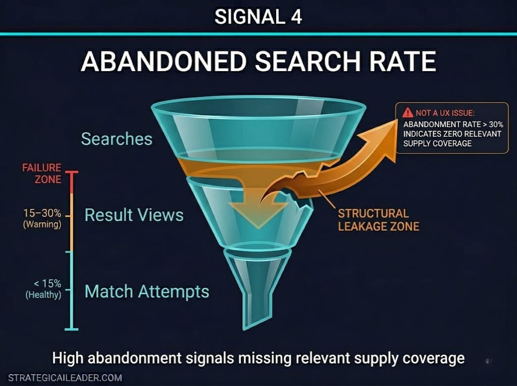
| What is the abandoned search rate in a two-sided marketplace? Abandoned search rate is the percentage of searches that end without a match attempt, result view, or conversion, indicating perceived absence of relevant supply. An abandoned search rate above 30% is a structural signal. It means demand is searching for supply that does not exist in sufficient density. |
Abandoned search rate is the bluntest signal in the diagnostic. It requires no inference. A user searched and found nothing worth clicking. That is a direct measurement of supply relevance failure.
The mistake most operators make is treating high abandoned search rate as a UX problem. Better search results. Improved ranking algorithm. Cleaner interface. These are all optimizations that matter at scale. But if abandoned search rate is above 30 percent in a category, you do not have a UX problem. You have a coverage problem. There is nothing to optimize around absent supply.
Below 15% abandoned search rate, the category is operating with sufficient supply relevance. Between 15% and 30%, you are in warning territory. You can see what is failing, but the category is still recoverable before churn accelerates. Above 30 percent, acquisition investment in that category will result in leaky retention, regardless of how good the experience layer is.
Signal 5: How to Measure Supply Coverage Gaps Before They Become Churn
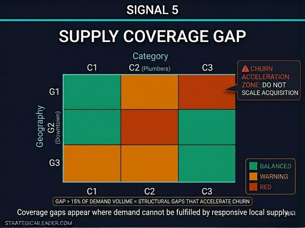
A supply coverage gap is a measurable deficit between the volume of demand requests in a category, geography, or time window and the available supply capable of fulfilling those requests. It is the most direct measurement of illiquidity, and it requires the most discipline to calculate correctly.
The common shortcut is to look at total supply count versus total demand request count. If supply count is higher, the assumption is coverage is adequate. This is wrong. A coverage gap is not about total volume. It is about whether supply and demand exist in the same places at the same times.
The coverage gap calculation I use: for each category-geography-time slot combination that accounts for at least two percent of demand volume, compare the number of demand requests to the number of available, responsive supply units. A responsive supply unit is one that is active, reachable, and capable of fulfilling the request type. A supply unit that exists but is inactive, overbooked, or outside the delivery window does not reduce the coverage gap.
Gaps below five percent of demand volume are manageable. Gaps between five and 15 percent indicate underinvestment in specific segments. Gaps above 15 percent are structural. Scaling demand acquisition into a segment with a 15 percent supply coverage gap accelerates churn, not growth.
Signal 6: What Is Segment Imbalance and Why Aggregate Supply Counts Hide It?
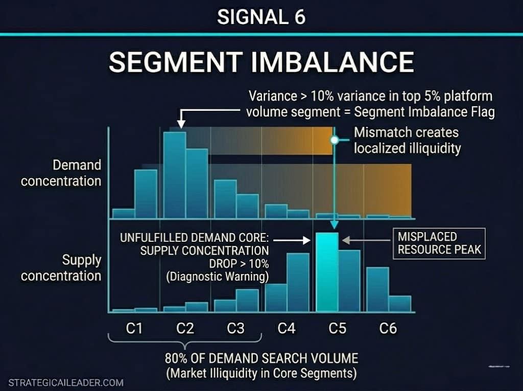
Segment imbalance signal is a diagnostic indicator showing that supply and demand are misaligned by category, geography, time slot, or buyer segment, creating localized illiquidity even when aggregate supply appears sufficient.
This is the signal that surprises operators most. The platform has a supply. The platform has demand. Both numbers are growing. But growth is flat. Segment imbalance is almost always the reason.
Segment imbalance is not about total volume. It is about whether the specific type of supply that a specific buyer segment needs is available at the moment that the buyer searches. A marketplace for home services might have 500 plumbers and high plumber demand. But if 80% of plumber demand is concentrated in a downtown corridor and 70% of plumber supply is in the suburbs, the marketplace is illiquid for the highest-demand segment, regardless of the aggregate numbers.
The threshold signal: when the variance between demand concentration and supply concentration exceeds 10% in a segment that accounts for more than 5% of platform volume, treat it as a segment imbalance requiring intervention. Above 25% variance, the segment is not liquid. Acquisition investment in that segment will not produce the retention necessary to justify the spend.
What happens when operators ignore these signals:
A marketplace with 20,000 listings and a 38 percent category match rate in its top demand segments will grow traffic while retention declines. Acquisition spend increases. Conversion appears stable in aggregate. But repeat search behavior rises as unmatched demand cycles back through the platform. Segment imbalance widens as paid acquisition fills demand at the aggregate level without fixing the geographic and category gaps at the signal level. GMV increases. Revenue stalls. The platform looks like it is scaling. It is actually leaking.
This is the pattern the Liquidity Threshold Framework is designed to surface before the acquisition budget runs. The six signals do not tell you the marketplace is broken. They tell you exactly which part is broken and why the aggregate numbers are hiding it.
How This Framework Would Have Applied at MyEListing
MyEListing is a two-sided commercial real estate marketplace covered in detail in the
The MyEListing growth experimentation case study documents a real-world operator environment in which supply-side quality and demand-side matching were active variables. Looking back through the lens of the Liquidity Threshold Framework, several diagnostic signals were present in the data.
Investor Match quality improved by 28% during the AI integration period, signaling that before the integration, the match rate was operating below its potential. The platform had listings. It had buyers. But match quality between them was the constraint, not volume on either side.
The 47% conversion rate lift during the strategy period did not result from adding more supply or driving more demand. It came from improving the quality of their connection. That is what the Liquidity Threshold Framework measures: not whether supply and demand exist, but whether they meet each other in a way that produces a result.
A retrospective run of the framework against the pre-integration state would likely have identified category-level match rate and segment imbalance as the primary failure modes. The framework would have surfaced the coverage problem before the experiment design started. That is the operator value: diagnosis before investment, not analysis after the fact.
(Note: Improvement figures cited above are sourced from the MyEListing AI Marketing Stack Integration dataset, which used proxy category metrics. They are directional indicators of match quality improvement, not direct liquidity threshold benchmarks.)
What the Liquidity Threshold Framework Does Not Do
The Liquidity Threshold Framework is a diagnostic, not a roadmap. Running the six signals tells you where liquidity is failing. It does not tell you how to fix the failure. That depends on whether the gap is a supply-acquisition problem, a supply-activation problem, a geographic-distribution problem, or a category-depth problem. Each requires a different intervention.
The framework also assumes your data infrastructure can segment match rate, time-to-match, and search behavior by category, geography, and time window. If your analytics are only tracking aggregate platform metrics, the framework will surface the limitation before it surfaces the diagnosis. That is a useful output, but it means the first operational step is data instrumentation rather than liquidity measurement.
A third constraint: the thresholds I use are directional ranges built from operational experience across service marketplace environments. Product marketplace dynamics can sustain different threshold windows, particularly for time-to-match. Use the thresholds as starting hypotheses, not fixed benchmarks. Calibrate them against your own conversion and retention data over the first 60 to 90 days of measurement.
Operator Checklist: Running the Liquidity Threshold Diagnostic
Run this diagnostic before increasing acquisition spend, opening a new geography, or expanding a category. Then work through these steps in order.
- Break match rate by category, not platform aggregate. Identify any category with a match rate below 65%.
- Calculate time-to-match at the category level. Flag any category above four hours for service or above 24 hours for product.
- Pull repeat search data for the last 14 days. Identify categories where more than 10% of users searched the same term twice without converting.
- Calculate abandoned search rate by category. Flag anything above 15% for review, anything above 30% as structural.
- Map supply coverage against demand concentration by category-geography pair. Identify gaps above 5%.
- Check segment imbalance by comparing demand concentration to supply concentration in your top five demand segments. Flag any variance above 10%.
- Score each signal: green (healthy), yellow (warning), red (failure). Any category with two or more red signals is not liquid. Do not scale acquisition into it.
- Identify the failure mode driving the highest number of red signals. That is where supply investment should go before demand spending increases.

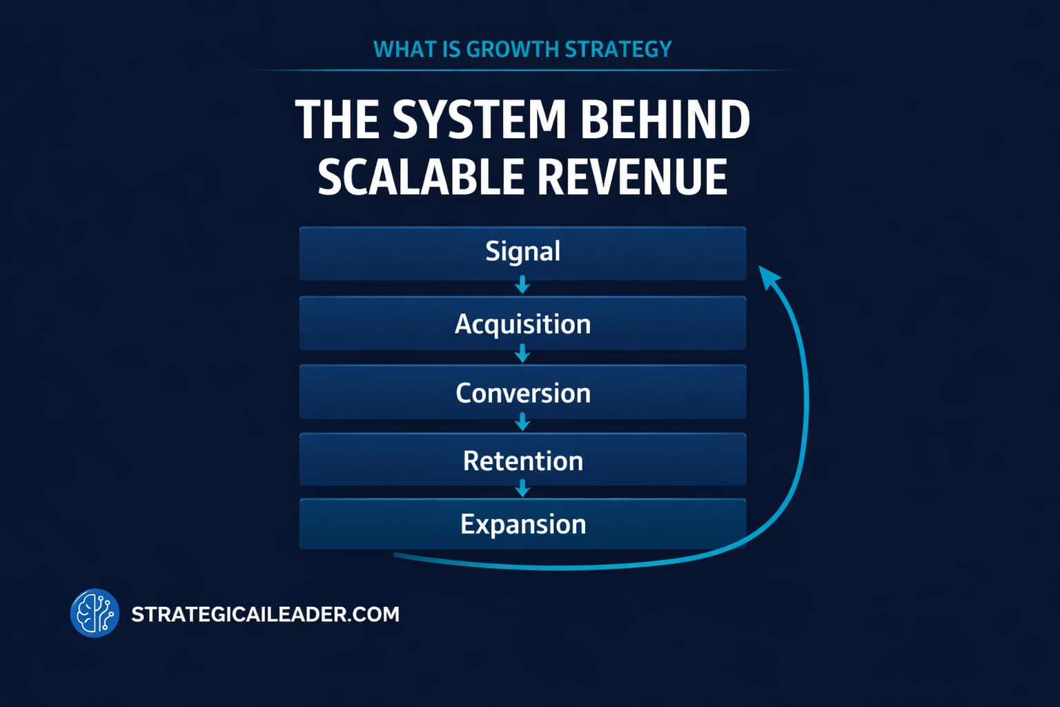
Where This Fits in Your Growth Strategy
The Liquidity Threshold Framework is the measurement backbone for the Marketplace Growth Strategy. Marketplace Growth Strategy: How to Build Liquidity First establishes the sequencing principle: liquidity before scale.
If you are building the broader growth operating system around this marketplace work, the growth strategy system article explains the layered model within which marketplace liquidity sits. Liquidity is not a standalone goal. It is the foundational condition that makes every other growth lever work.
A Note on External Benchmarks
The threshold ranges in the Liquidity Threshold Framework are directional and should be calibrated to your specific marketplace type. For deeper theoretical grounding on marketplace liquidity dynamics, the cold start problem literature, including work from a16z on network effects and Andrew Chen’s research on marketplace cold starts, provides the conceptual foundation that the diagnostic framework operationalizes. NFX research on two-sided marketplace dynamics is worth reviewing for category-specific match rate benchmarks as additional calibration references.
What Comes After the Diagnostic
Most marketplace operators scale too early. The signal they trust is demand interest, traffic, signups, and early GMV. Those signals feel like liquidity. They are not.
Liquidity is the state in which supply and demand reliably find each other, in the right category, at the right time, in the right geography. That state cannot be assumed from aggregate numbers. It has to be measured at the signal level provided by the Liquidity Threshold Framework.
The six signals are independent failure modes. Running the diagnostic takes discipline because it forces you to look at where the platform is not working, rather than where it is working. That is the uncomfortable data that determines whether your next acquisition investment compounds or leaks.
Scale a liquid marketplace, and you get accelerating returns. Scale an illiquid one, and you pay to acquire demand that leaves before it converts. The diagnostic runs in a day. The decision it informs is worth the hour.
Want the next article in the Marketplace Growth Strategy series?
Most marketplace operators measure total supply and total demand. The operators who scale sustainably measure six things that most of their competitors do not. Subscribe to StrategicAILeader for the next article, “Marketplace Supply Coverage: How to Diagnose the Gaps Before You Scale,” plus the full set of articles as it builds.
Want the frameworks before the articles are published? Subscribe to StrategicAILeader. Operators building real systems get the model before the post. Connect with me on LinkedIn or Substack for conversations, resources, and real-world examples that help.
Explore the Strategy Library
This article is part of a broader operator framework library covering AI execution, growth systems, and revenue infrastructure.
- Case Studies
Applied AI product launches, evaluation frameworks, and deployment decisions. - AI Strategy
Model selection, guardrails, automation architecture, and enterprise AI readiness. - AI + MarTech Automation
Workflow automation across acquisition, attribution, and lifecycle systems. - Growth Strategy
Compounding revenue systems across positioning, channels, retention, and expansion. - Revenue Operations
Pipeline architecture, forecasting reliability, and GTM infrastructure. - Sales Strategy
Deal velocity, qualification frameworks, and enterprise conversion mechanics. - SEO & Digital Marketing
Search-driven growth, authority building, and technical visibility systems. - COO Ops & Systems
Execution infrastructure, process scaling, and operating cadence design. - Leadership & Team Building
Organizational alignment, hiring systems, and operator capability development. - Strategic Thinking
Decision frameworks for complex product, platform, and market environments. - Framework Visuals
Operator diagrams, system stacks, and execution maps. - Personal Journey
Lessons from building platforms, shipping AI products, and leading execution teams.
Want 1:1 strategic support?
Connect with me on LinkedIn
Read my playbooks on Substack